Environmental Design & Wayfinding
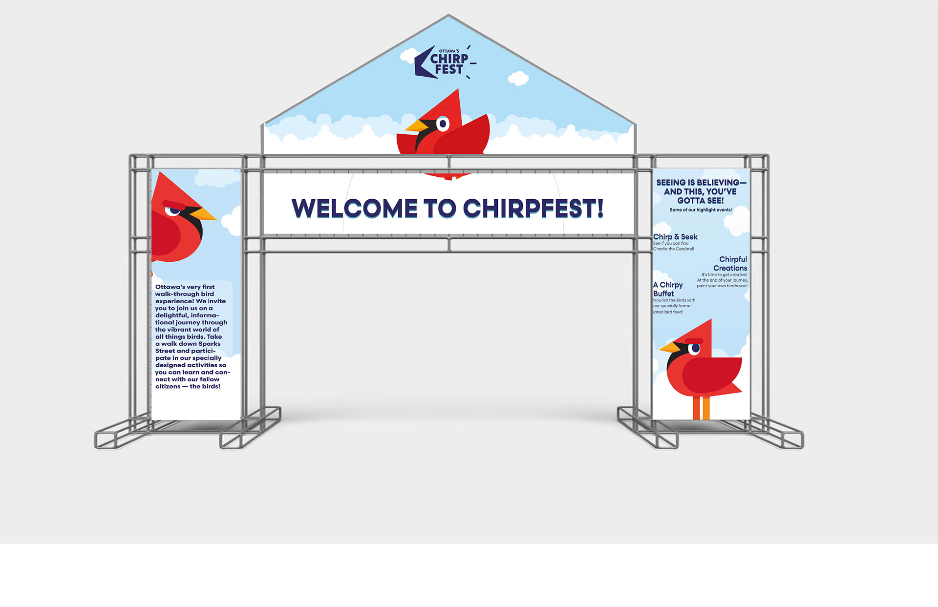
Chirpfest: An Urban Bird Awareness Campaign
Client: City of Ottawa & Ottawa Field Naturalists
Venue: Sparks Street, Ottawa, ON & Confederation Park, Ottawa, ON
Scope: Concept Creation, Branding, Signage, Copyright, App Development
Year: September – December 2024
Venue: Sparks Street, Ottawa, ON & Confederation Park, Ottawa, ON
Scope: Concept Creation, Branding, Signage, Copyright, App Development
Year: September – December 2024
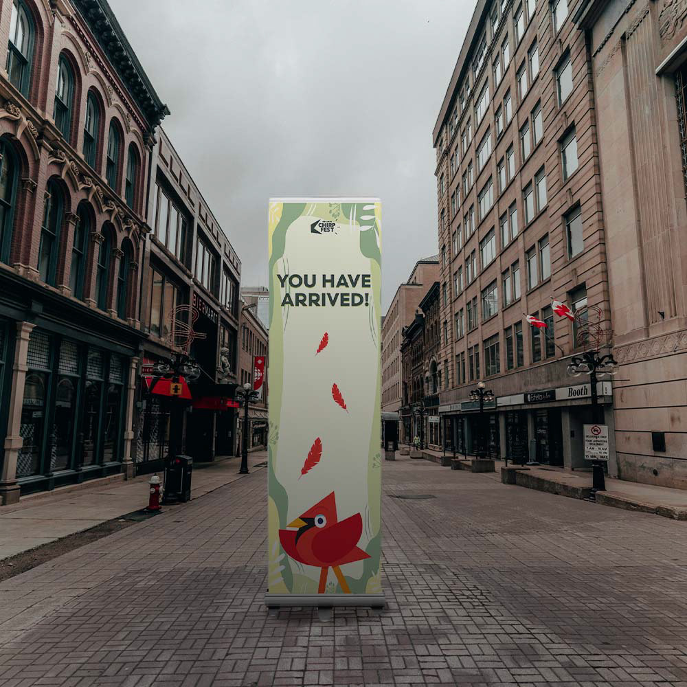
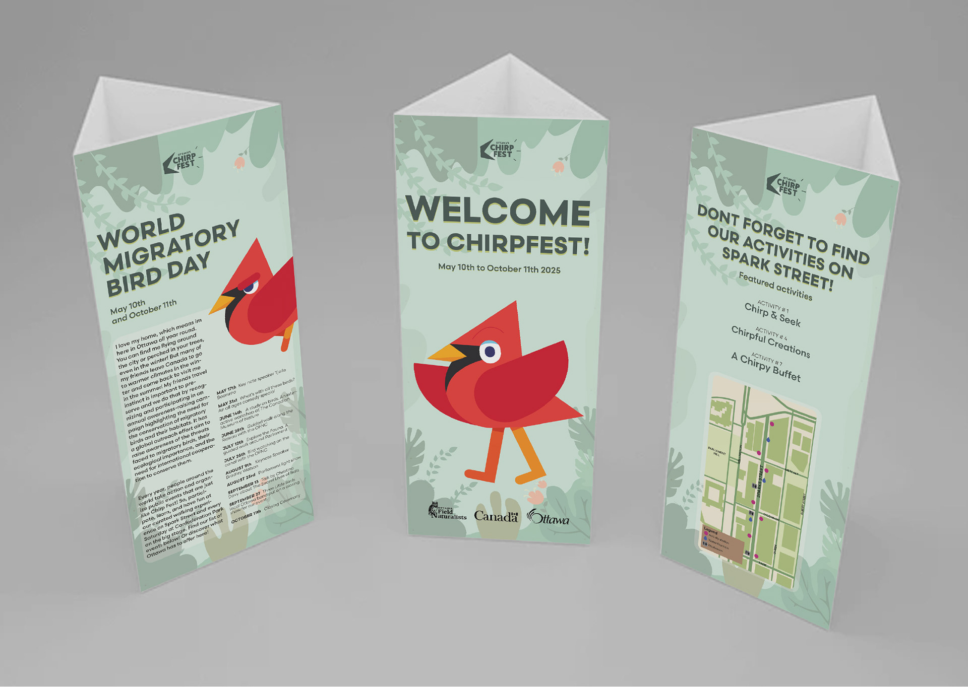
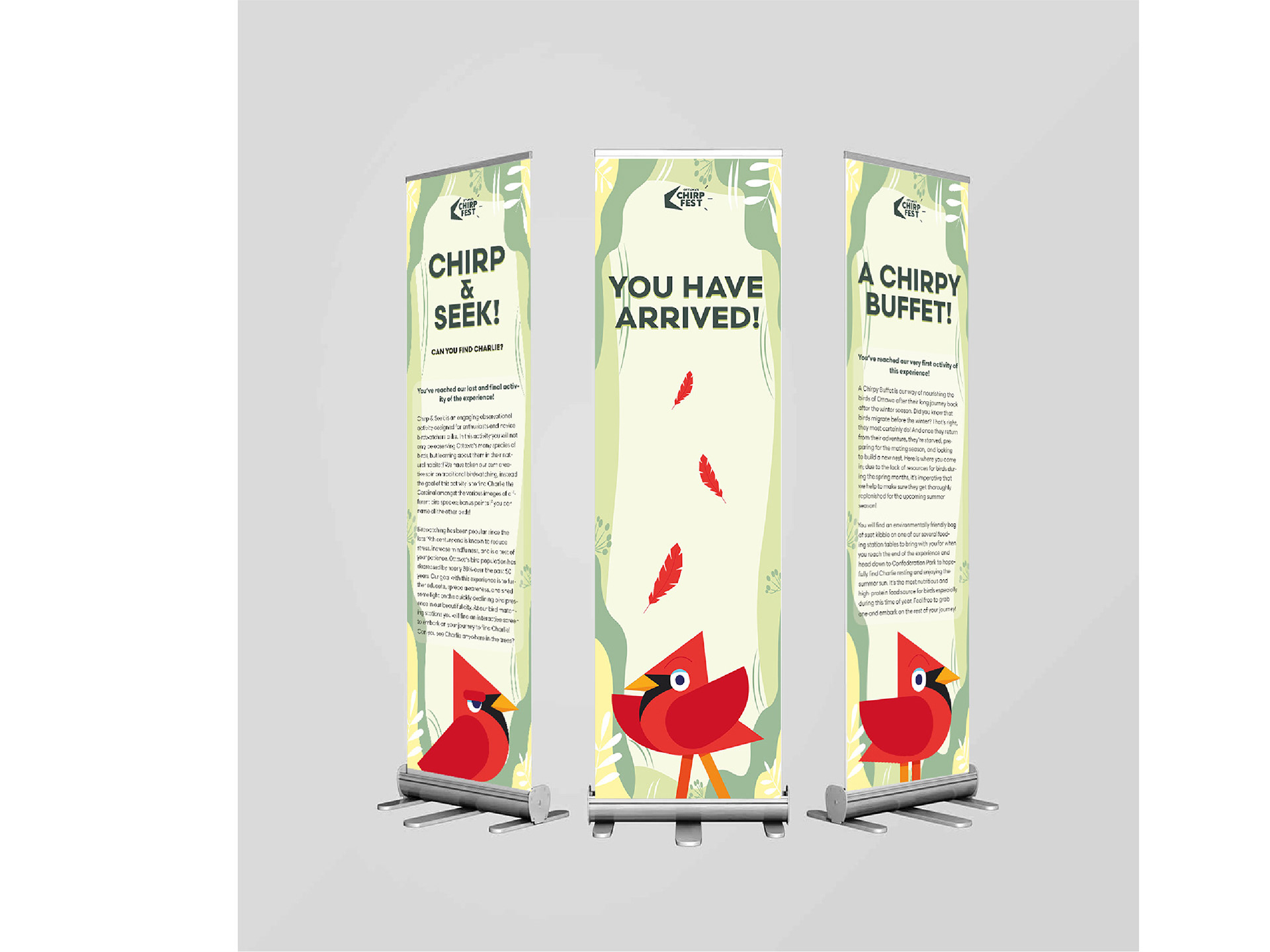
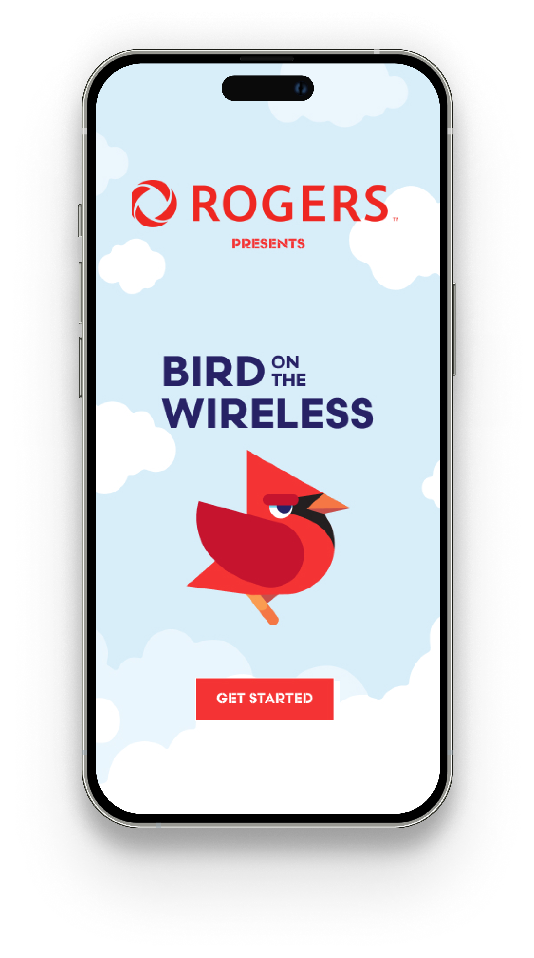
Chirpfest is an interactive urban awareness campaign transforming downtown Ottawa into a bird-friendly city, one chirp at a time. By bringing local wildlife to the forefront through a thoughtful environmental brand system and engaging activities, the campaign makes conservation accessible for the whole family—led by a cheeky mascot, Charlie the Cardinal, and his "informationally funny" chirps.
Project Brief
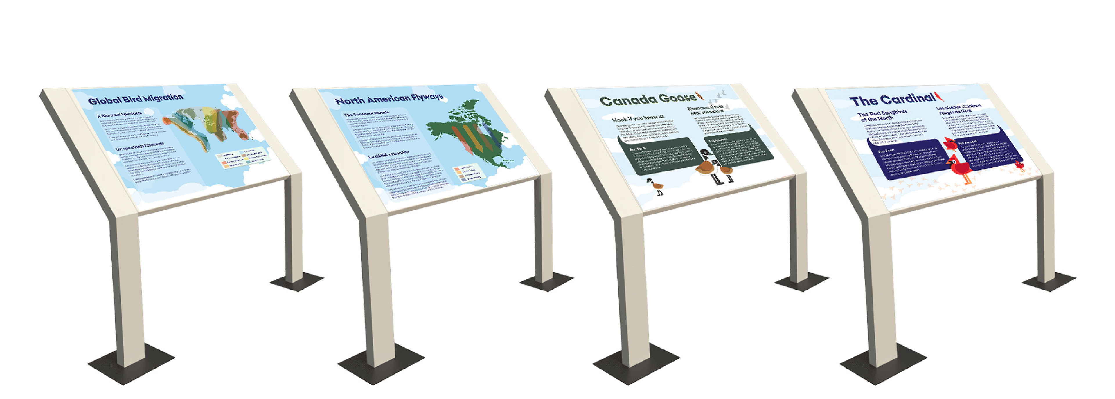
The objective was to build a comprehensive experience for a five-month program that promotes bird awareness in the National Capital Region. Spanning from Spring World Migratory Bird Day (May 2025) to Fall World Migratory Bird Day (October 2025), the program featured bird-watching events, a lecture series, and various interactive exhibits. The project required a full suite of deliverables, including wayfinding signage, placemaking elements, interpretive panels, and promotional materials.
Goal
To develop an immersive experiential graphic design campaign celebrating Ottawa’s designation as a Bird Friendly City. Launched in the heart of Centretown, the project transformed urban landscapes like Sparks Street into interactive educational hubs to bridge the gap between high-density infrastructure and local biodiversity. Simultaneously, the campaign offered an “open-house” opportunity at Confederation Park for people to reconnect with nature. Our team prioritized a playful, cheeky, and informative tone to drive community engagement and online buzz.
Location & Ideation
The modern urban landscape can be hostile to birds, characterized by reflective glass and "anti-bird" architecture. However, Ottawa's core is unique in its proximity to natural beauty. We chose to highlight the possibility of urban cohabitation by reminding the public that birds are as much a part of the city as we are. To avoid a "preachy" tone, the team pivoted toward a humorous approach—and thus, Charlie the Cardinal and Chirpfest were born.
Charlie & Chirps
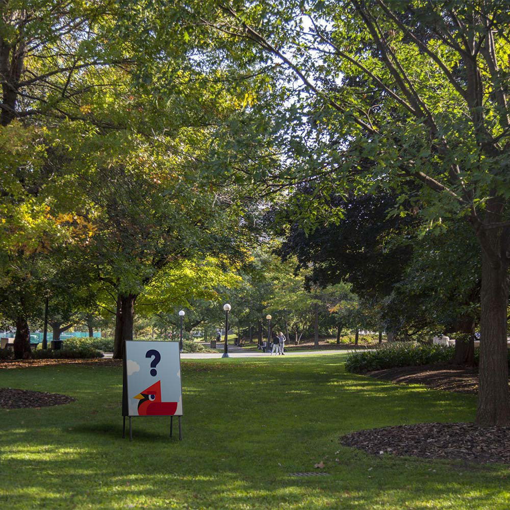
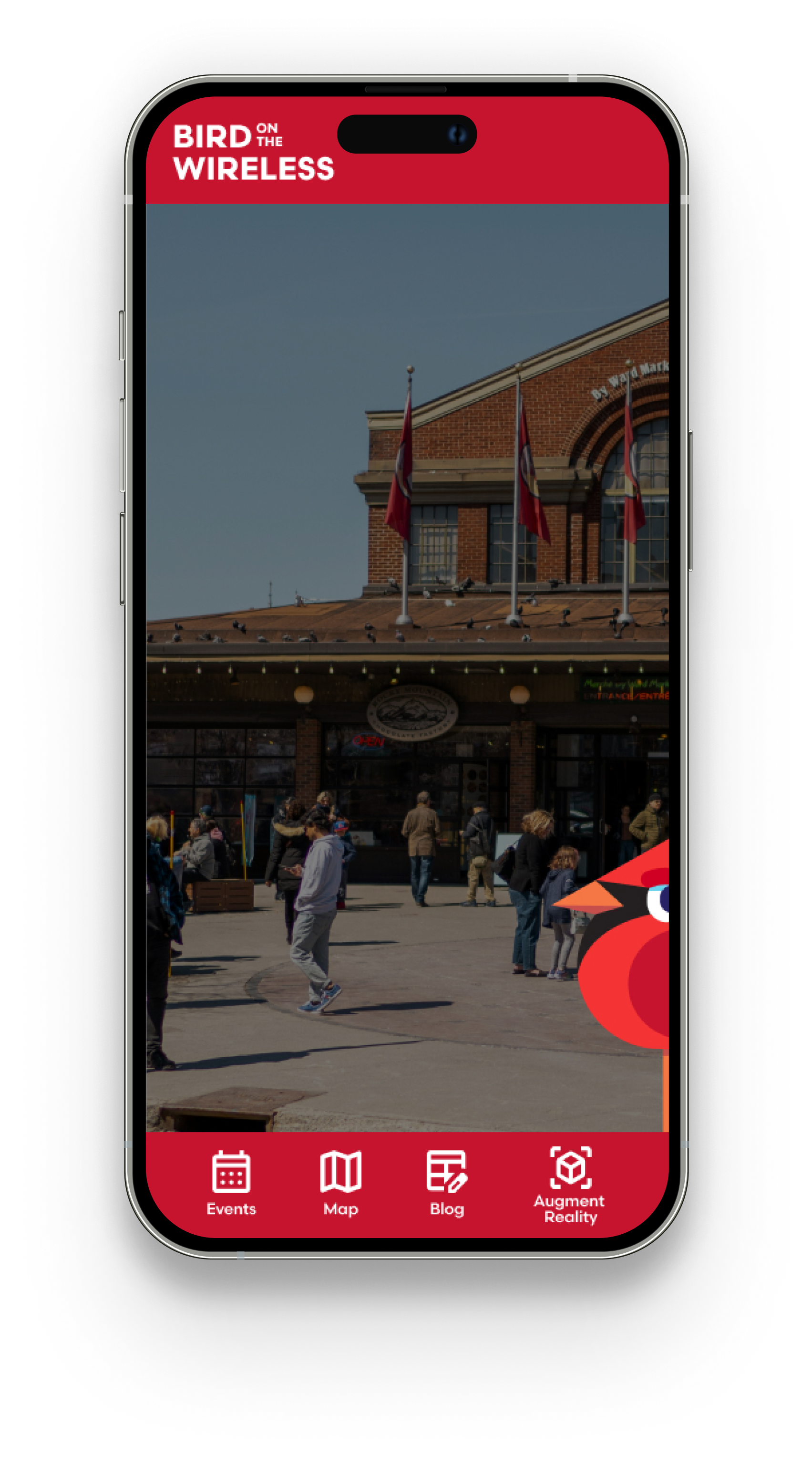
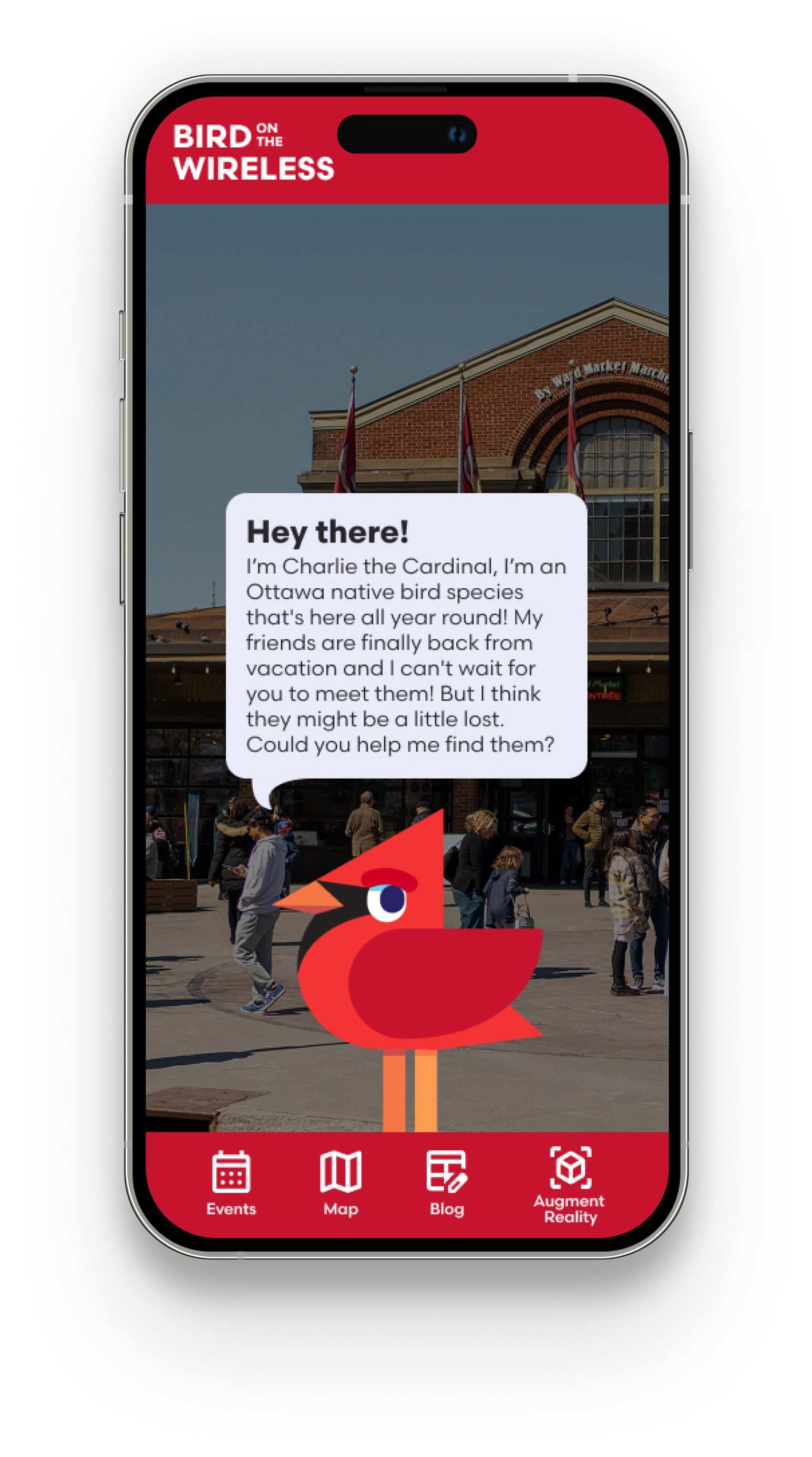
As a bright red, non-migratory resident of Ottawa, the Northern Cardinal was the perfect "urbanite" mascot. We developed Charlie as an animated character who “chirps” the public with light teasing and witty banter—a play on Canadian slang designed to make the adult population chuckle while they learn. To bring Charlie to life, we explored projection mapping on Sparks Street and developed an Augmented Reality (AR) experience where users could search for him in the wild.


Urban Landscape Design
We tailored our visual language to two distinct environments:
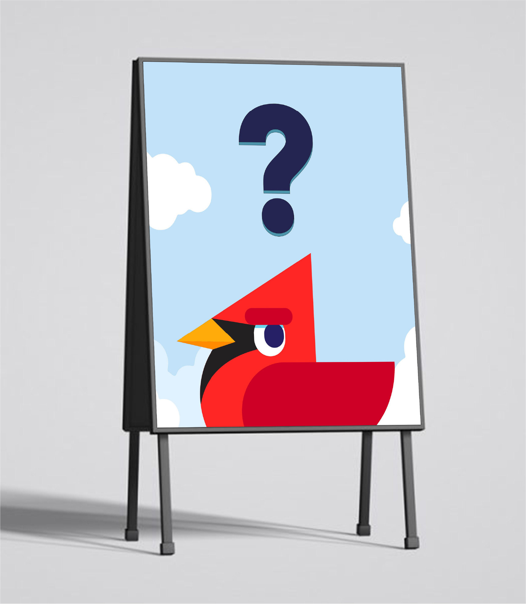
Confederation Park: We created a bright blue-sky motif to contrast with the park’s lush greenery. The goal was a relaxing, immersive atmosphere where signage and interpretive panels could be consumed at a slower, more thoughtful pace.
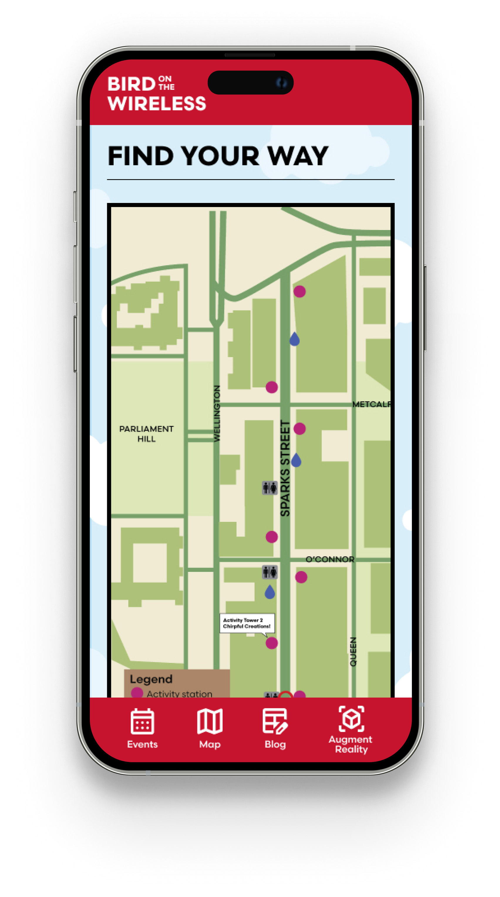
Sparks Street: To contrast the muted grey and beige tones of the government-centric pedestrian mall, we developed "urban forest" backgrounds. Bringing trees and vegetation into the wayfinding breathed life back into the concrete landscape and integrated seamlessly with the digital activities.
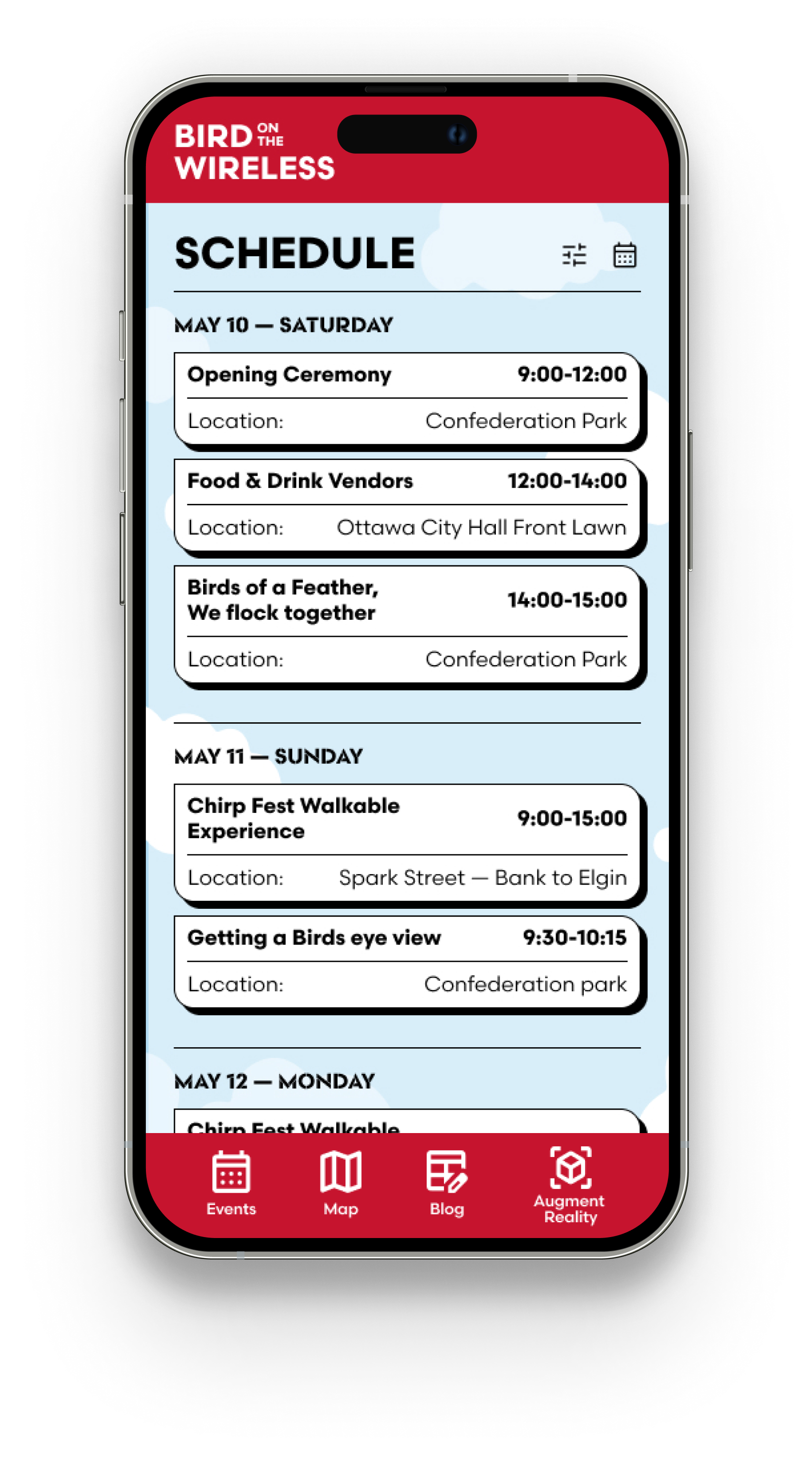
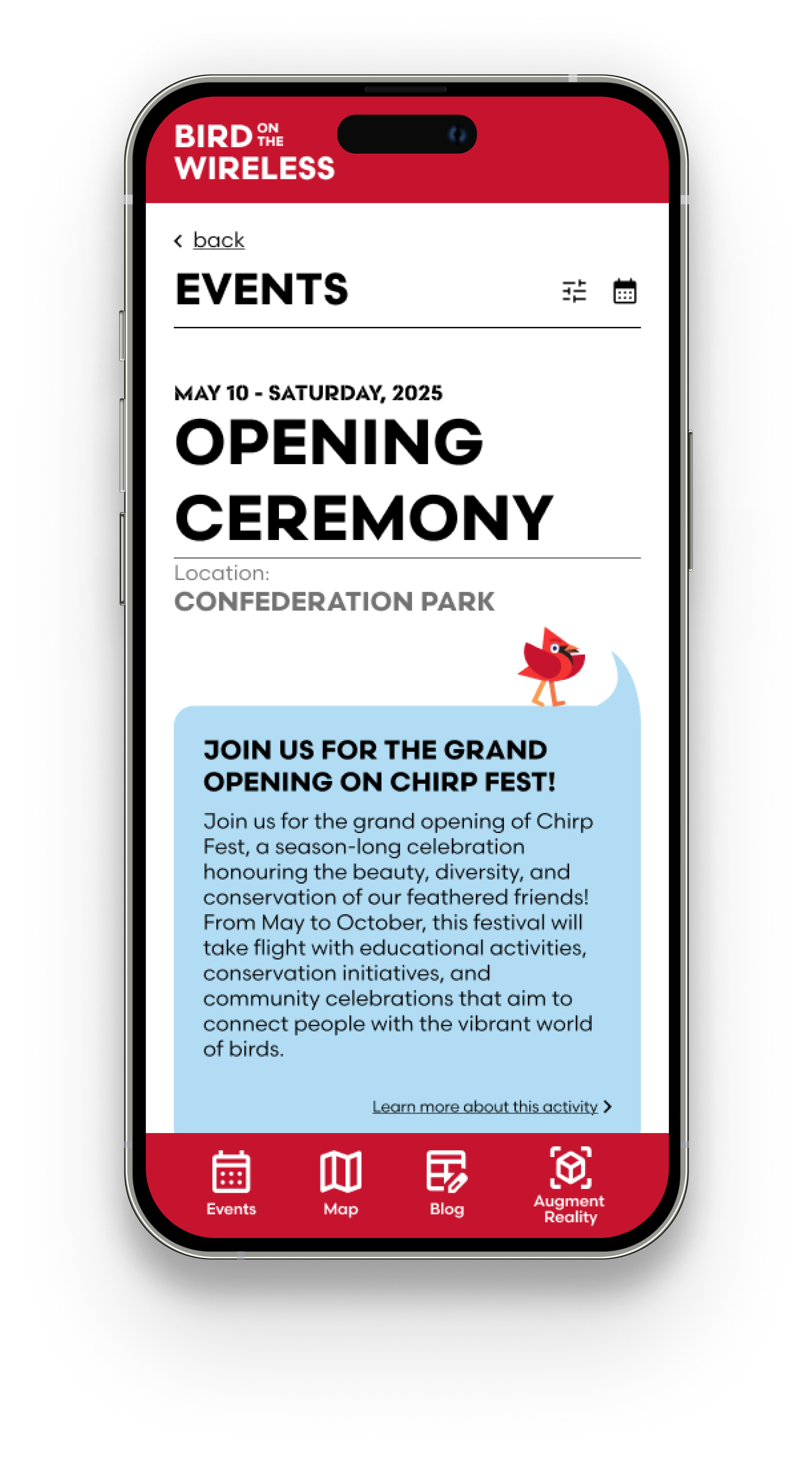
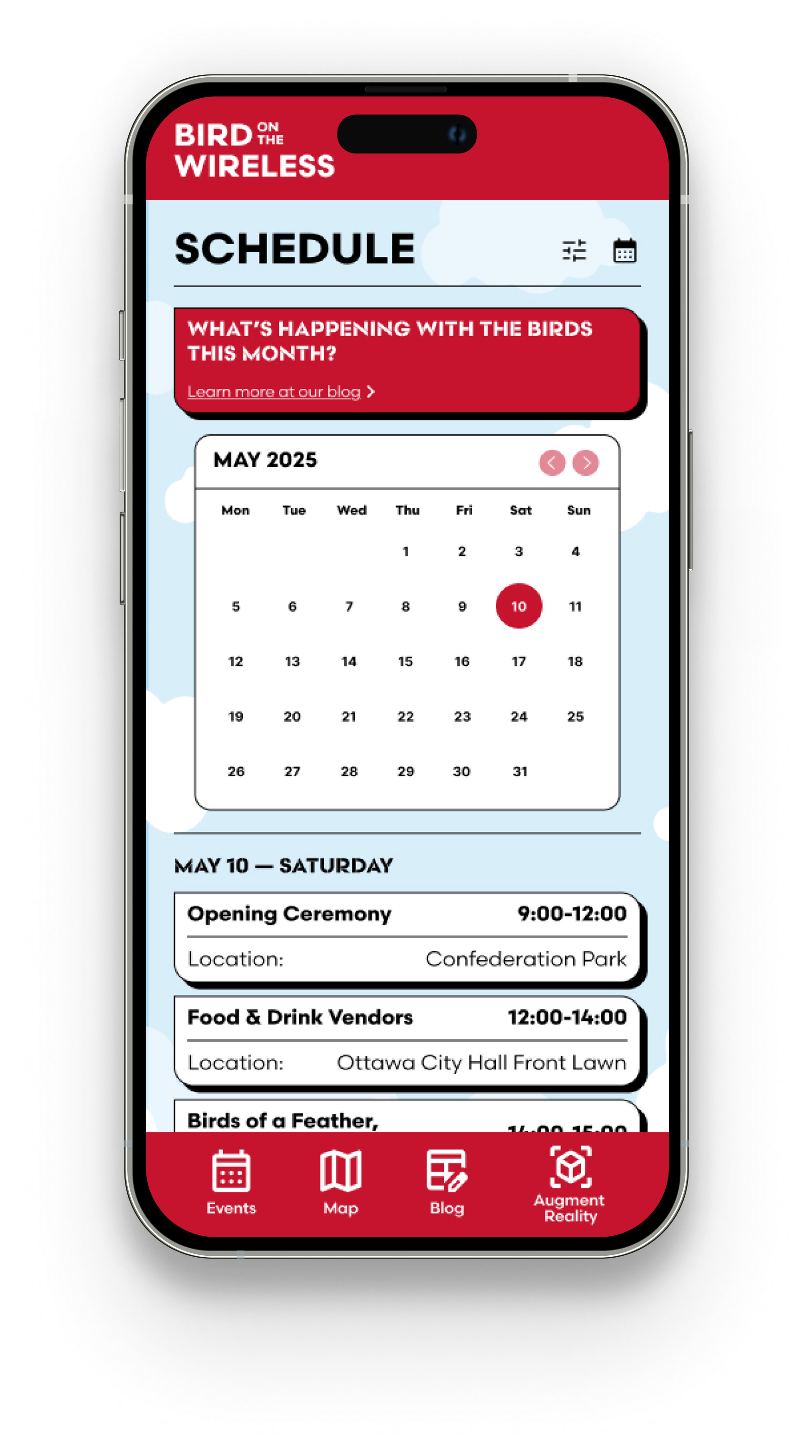
Chirpfest App
I developed the Chirpfest App to act as the campaign's central nervous system. It blended with the brand identity to provide a direct channel for festival updates, including a feature that lets users sync activities with their personal calendars. Crucially, the app served as the platform for the AR experience, allowing families to scan the city, "find Charlie," and learn about the importance of local avian life through an interactive lens.
Final Outcome
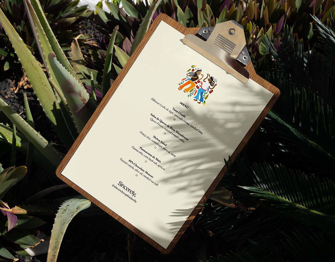
The final visual identity successfully and clearly conveyed what guests could expect from attending the pop-up. The illustrations established a distinctive, recognisable presence across social media, standing apart from her other content at a glance. In its physical form, the printed menu felt simple yet sophisticated, reinforcing the immersive upscale atmosphere.
Despite the accelerated timeline, the identity successfully captured the emotional and cultural influence of Oaxaca while seamlessly integrating into Sauced’s environment, leaving my client incredibly happy and eager to use these illustrations again. The night ended with good food, good wine, and a little bit of salsa dancing.